During the process of this project I have developed and learnt a lot of skills in which were very useful during the process of producing my media texts. The main programmes that I used for my products were Adobe Photoshop, Adobe Premiere Pro and the photo editing website 'Picmonkey'.
To edit my music video for the main project of my Advanced Portfolio in Media, I used Adobe Premiere
Pro. This was the first time I had ever used the programme and I found it both interesting and challenging. I surprisingly got the hang of how to use it rather quickly. I received a short tutorial from the College's Media technician on the basics of Premiere Pro which involved me importing my footage into the programme so I could begin editing. I started dragging the footage onto the editing line where I would begin placing the each shot in the necessary place which would start to form the video. I found this very simple, I began getting to grips with how to shorten and lengthen the shots to footage to fit within the video. I was struggling for ideas and techniques of editing so I began exploring the effects tools within the programme. I discoved a whole range of editing tools such as tone, contrast, brightness, greyscale, levels etc. It was then when I decided to add the 'Greyscale' effect to represent the 'inner self' side of the character. I then used the 'Auto Tone' and 'Auto Levels' effects on the other footage that wasn't the 'inner self' to represent a more colourful and wild side of her.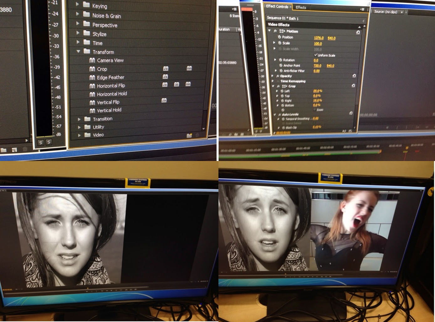 I took inspiration from a class peer nearby who had used a split screen within her video, I spoke to her about it and she suggested that I use it within mine. I realised this would be very helpful to helping the audience to recognise the split personality within the video. To do this I selected the two pieces of footage (one using the 'inner self' side of the character' footage and one using the 'fake front' side of the character footage). I then edited them so they were both singing the exact same section of the song. I then positioned one of the pieces of footage into the section of the video I wanted it to be in. I then put the other piece of footage directly above the other piece in the 'Video 2' row of the editing line. I then added the effect 'Crop' into the video by dragging the effect onto both of the pieces of footage that would later be part of the split screen. I then was control the crop effect in the 'Effect Control' section of the programme. I used the 'Position', 'Left', 'Right', 'Top', 'Bottom' aspects of the control panel to I could alter the split screen and move it to the require place. Once I had positioned both of the pieces of footage in the desired place I then pressed play on the playback section of Adobe Photoshop and checked everything was the way I wanted it to be.
Next up in the ancillary text project was my magazine advertisement, I again used Adobe Photoshop and the photo editing website 'picmonkey'. I began the process by using 'picmonkey', I cropped the image that I selected to a portrait shape which would later form the background of my advertisement. I adjusted the brightness and exposure of the photograph in order to create more colour within the image. I then used the 'Tranquil', 'Dusk' and 'Boost' tool in order to create more of a browny-red colour on the picture. I would normally have edited the flaws within the photograph and then added lipstick and other makeup tools onto the image, however this was unnecessary. I then opened up Adobe Photoshop and began the further editing to my magazine advertisement. I then used the black and white/greyscale in order to make the link between the advertisement and the music video. I then utilised the tool in order to adjust the contrast and exposure of the filter. I then opened up Microsoft Powerpoint in order to create a red shape that would take up the bottom of the advertisement. I then copied and pasted the shape into Adobe Photoshop and then adjusted the size and positioning to the correct size and place. I then used Microsoft Powerpoint to create the shape again but in black to go next to the red shape on the advertisement. I then added this into Photoshop and then adjusted the size and moved it to the correct place on the advertisement. I then added the album front cover onto the page so I could have this in the bottom right side of the poster as this is an convention of this genre (to include the front cover on the advertisement). After this, I adjusted the size and positioned the cover on top of the black shape that was at the bottom of the page. Next up was adding the necessary logos to the advertisement. These included the record label's logo (Parlophone), the parental advisory logo, and the social media logos (Facebook and Twitter). I added all of these to Photoshop and then adjusted the size and moved them on top of the black shape underneath the album cover. It was then time to add the large text to the advertisement, I started by adding the 'THE NEW ALBUM' text to the page. This was written in the 'Agency FB' font that I have used throughout the project, I readjusted the size and changed the colour to black to make it match the running colour scheme of the entire project. The next piece of text was 'I LOVE IT' (the album title), I wrote the text in the same font as the last, I then altered the colour to red (to match the colour scheme) and then readjusted the size and placed it in the correct position. The final piece of the large text was 'OUT 14.04.14' I adjusted the colour to black, increased the size and then moved it to the correct place just above the image of the front cover. I then began adding details of the UK tour dates. I started this by adding the title 'UK TOUR DATES 2014!' I made the 'UK TOUR' part of the text white to make that stand out to the naked eye. After that, I began adding the tour information, this included the venue and the performance dates. All of the information was in the font 'Agency FB' with the venue information coloured in white and the performance dates in black. I did this for each venue and date on the tour until I had completed. Once I had filled the red shape with tour information my magazine advertisement was complete.
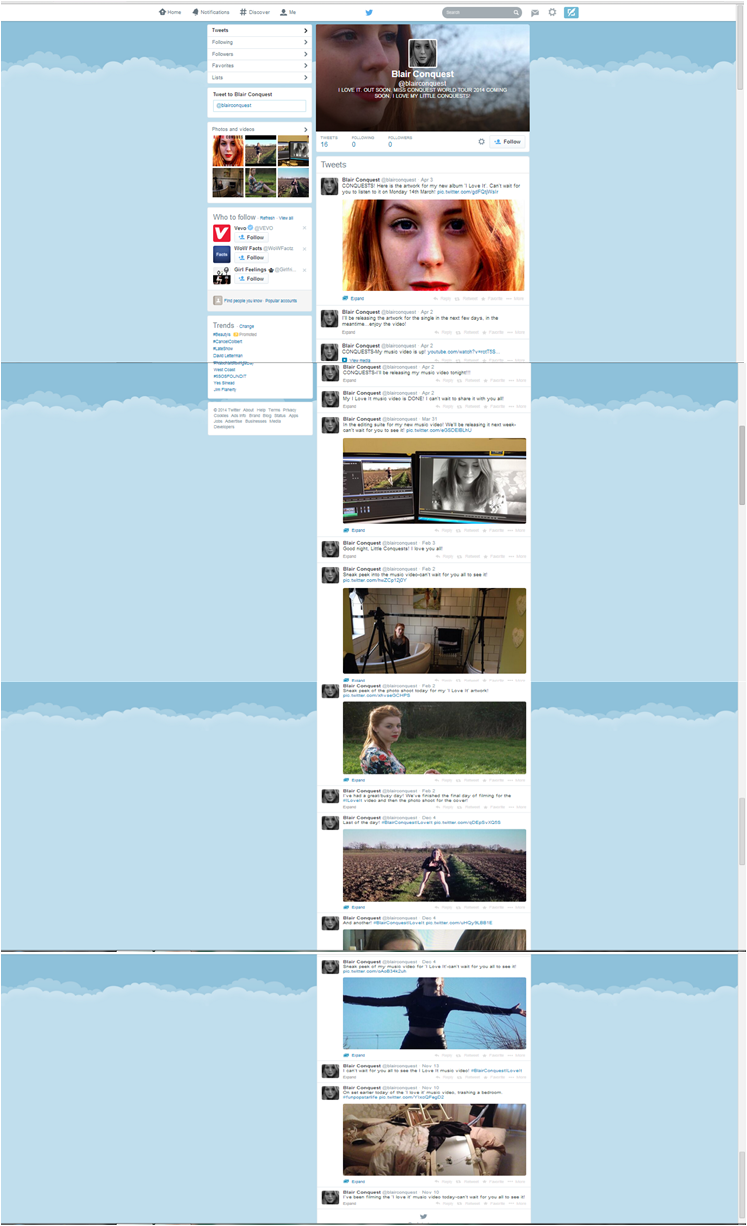 Another media technology I used throughout the process of this project was social networking website, Twitter. I used the website in order to tweet from it as if I was my artist 'Blair Conquest'. I used photographs that I had taken at the photoshoot for the digi-pak as the display picture and header for the profile. On this I tweeted as if I was talking to the artist's fans ('the conquests' or 'little conquests') telling them about photoshoots that she was having, filming for the music video that was occuring, behind the scenes photographs, pictures of the editing suite and previews of the music video. The whole idea of it was to act is if Blair was actually a real person and was infact a real life world famous singer. This also helped me to create a character for who Blair Conquest is and how I can present her in my media texts.
No comments:
Post a Comment