Gaining audience feedback was a crucial aspect of my project, I made a habit of trying to receive as many comments as possible from people within my target market in order to get a fair idea of what the general reception is for my products. I began by asking my friends to watch my final music video and then writing a short paragraph about what they thought about it. I received some very positive feedback, they also gave some helpful suggestions on what I could improve if I had the opportunity to do it again. A comment that was brought up a lot was that they enjoyed the difference and contrasting personalities and the different colour filters that are edited onto the footage. Some understood that the reasoning behind this was because of the split personalities within the one character, others perceived it purely as an editing and visual technique. One girl also mentioned that she liked the fact that I have used two costumes, this gives me the idea that she didn't get the reasoning behind this and perceived the reason for it as purely for a variety of costuming. I think if I was to do it again, in order to make the split personality much clearer I would alter the costume of the character that is showing her 'inner self' this would be changed to a boy's large shirt, this would hint that it is her ex-boyfriends that she has collected over the period of their relationship. She would also have mascara running down her face to make it fully clear through her costume that she is another side to the character. Someone suggested using a boy within the music video so the audience has someone in mind to refer to when the artist is singing about them. I was strongly considering this when planning my music video, however I didn't feel it was relevant to the music video to have a boy involved within it, the concept for it was to argue the song's suggestion that she doesn't care, and focussing on whether she did infact care and it was indeed bothering her, therefore I felt including a boy within it would lower the impact of this point. Also when I was researching media texts of the selected music genre, there wasn't that many boys included within it, the focus was mainly on the artist as opposed to the boy that the song is centred around. One girl mentioned that she wasn't so sure on the split screens within the video, I think this was necessary to give a hint to the split personality of the character, however I do agree with her as I do agree that I believe that I could have chosen better footage for the split screens as they're a little shaky at times and it isn't the best footage. This would be replaced with more appropriate footage if I had the opportunity to do it again. A lot of the people mentioned that they liked that I had put all the edit transitions on the beats of the music, I agree with this, I am very satisfied with this element of the video. It's something I noticed as a convention within music videos that are in the genre that I had selected. Others also mentioned that they enjoyed the use of many different locations. I also agree with this, I think it keeps the audience alert as there are many different places and things to look at.
I decided to carry out a focus group of students within my target market. I found this very helpful, they provided a lot of comments about what they liked and what they thought wasn't the best. My question for them in the video above was 'What are your overall thoughts after watching the music video?' The first comment that I receive is 'I don't really understand why she is in the bathtub.' I can see why she doesn't understand this, I think it would make a little more sense and seem more adventurous and wild for the character if she was in the bath with water in whilst she was wearing clothes as it is unexpected. This was originally the plan however we didn't film the footage with water in the bath for reasons beyond my control. The same girl however later mentioned in her written paragraph about it that she now understands the reasoning behind it and understands that it is done to give her a wild and crazy attitude. I got the feeling (similar to the written paragraph feedback) that the focus group participants didn't understand the split personality motif that is within it. I then explained it and every person then understood and said that they now notice this now that I have explained it. This isn't good enough as I would not be able to explain it to every audience member if it was a professional text, therefore if I was to do it again I would think of numerous ways of clearly showing the split personality aspect of the video.
I then asked the same focus group a different question. This time asking their overall general thoughts after seeing the the ancillary texts. The first comment referred to the Compact Discs that I had created, she mentioned that 'they look professional' and that she really liked them. These weren't actually part of the ancillary text project but it was handy to get a general comment about what people thought about this for if they were indeed part of the project. The next participant mentioned that she liked the digi-pak saying that if
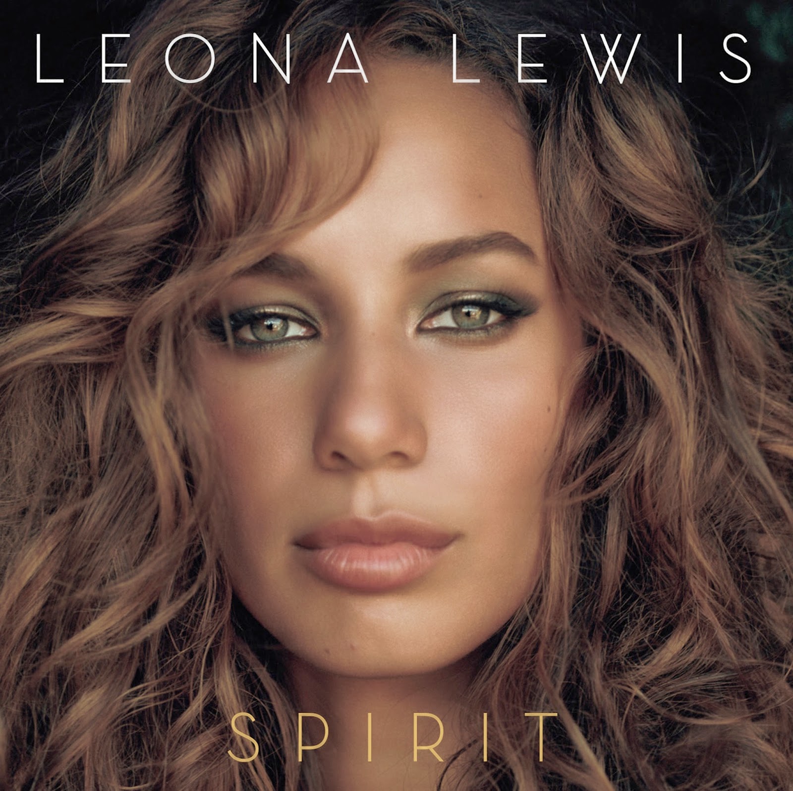 she walked into a store and saw that it would stand out to her and that she would be interested about who the artist was and be enticed to take a closer look. In reference to the front cover she said 'it's just a face, it's like look at my face' this was my overall intention for the front cover, the main reason for any front cover and album is to provoke sales which is why I went for the most appealing look I could find in the hope that it would entice sales. The first participant then mentioned that it very similar to Leona Lewis' 'Spirit' album. Leona Lewis' album front cover features a close up shot of her face. The frame is taken up by her face and her hair that is very large. The text is practically identical to mine in regards to placing. Her name is at the top and the album name at the bottom. Both of these are present on my front cover also. I had not seen this front cover before I planned my ancillary texts, however this does prove that my digi-pak is linked to conventions of the genre that I have chosen. Jacob, the only male in the group mentioned that he thought that the UK tour dates at the bottom of the magazine advertisement should be larger and more visible as it is difficult to see them as of now. I agree with this, when I was in the editing stage of the advertisement the tour dates looked very visible and rather large, but looking back now on the final product I can see what he means. If I was to re-do the advertisement I would make the UK tour dates much larger so they can be seen easily.
I was finding their suggestions on improvements very helpful so I decided to ask them one final question 'If there was anything you could change anything in any text, what would they be and why?'. The first participant to answer was Hollie. She repeated some of the points that had already been suggested in earlier questions of the focus group (the tour dates on the magazine advertisements should be made more visible, she doesn't understand why the artist is in the bath within the music video and she thinks I should make the image on the magazine advertisement coloured). Hermione then suggested making it clear from the very beginning that the character has a split personality. I agree with this and I would aim to make it clear from the opening and throughout that there is a split personality if I was to do it again. Charlotte then backed up my reasoning for making the main background image of the magazine advertisement greyscale by saying that she understands that the greyscale image links to the music video and has a good combination. Jacob then suggested that the 'OUT 14/04/14' text on the magazine advertisement should be a different colour as it is difficult to see the text with the black and white background. I agree with this as looking back now I struggle to see the text, similar to the UK tour dates situation, in editing it was clear to see the text. If I had the opportunity to re-do it, I would have it in a different colour.
No comments:
Post a Comment