The conventions that the music genre (electro-pop/dance pop)
I selected were a crucial aspect of the planning for my media products. During
my research into the conventions of the research for my music video project, I
recognised that the majority of the videos that fall under this genre tend to
go for the group, party and celebratory vibe with an energetic and happy mood
for the entire video. I wondered what it would the outcome would be if I
challenged these popular techniques and went for a different idea for my music
video. The song I had selected to create my music video for was Icona Pop’s ‘I
Love It’ which explains that the singers are simply not concerned and do not
care about their recent break up from their partner. Which prompted me to
attempt to twist the idea of this and question what would happen if this wasn’t
necessarily

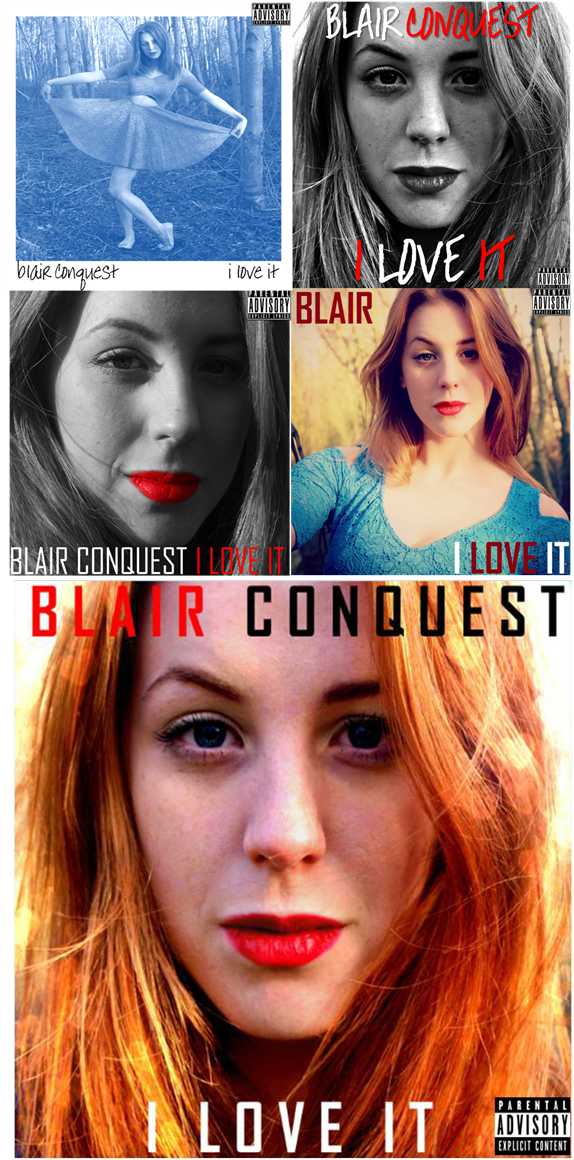 In regards to my album digi-pak. The conventions for digi-paks within this genre were generally very modern with close up or medium close up images on the front cover and modern (normally narrow) text for the album title and artist name. For the rest of the digi-pak, existing texts were similar to this and included medium close-up shots with sometimes the long shots. This is why for my ancillary texts I decided to incorporate these ideas as inspiration for my project. I began working on my drafts and attempted to include unique and modern editing techniques in regards to colour and styles, as shown on the right. The majority of the photographs that I took for the dig-pak were close up and medium close up shots to fit with the conventions that existing texts within the genre use. I aimed to use primary colours within my images as they would prove eye catching with the general public upon release to stores as well as fitting with the conventions of the genre the most suitably. I used a lot of red and white as they're both colours that are used in all three texts of my project to create links between them all. For the front cover and the back cover (for the track list) I experimented with different fonts that would suit the genre and the style that I was going for. In my final draft) I stuck with the colours that I had been going with all along-red and white. I then added black in there as it worked well with the image that I had decided to use. I eventually decided on the font 'Agency FB' as this would look the most modern out of all the fonts I was considering. The image I finally went for the in the front cover was a close up image that I took in a forest during the on location part of our photo shoot day. Then for the rest of the digi-pak the majority of the images were close ups and medium shots. The back cover was a medium shot of the artist in a forest, whilst the two disc holders in the digi-pak consisted of two halves of an image where the artist is laid on a bench, the lower half of her body is on one of the disc holders and the upper half on the other. I decided to do this as I saw this idea in an existing text within the music genre and it seemed like a clever idea. I am very happy with my final digi-pak, I think it looks quite professional within reason and is sticks very much to the conventions that I have research and follows well all my research findings.
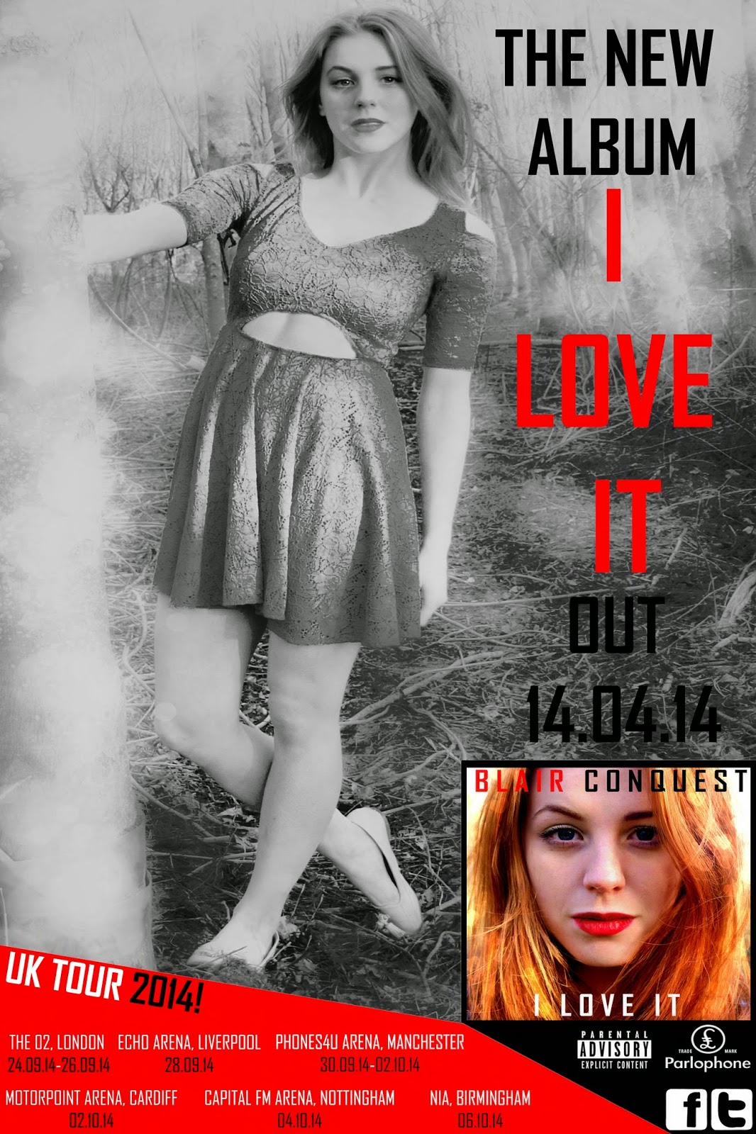 When I was researching professional media texts for the Magazine Advertisement I noticed that a lot of the texts included the album's front cover on the poster and incorporates it very much within the advertisement. I began looking into these ideas and how media texts of this style handle this and go about doing it. The majority of the advertisements had an image of the front cover at the bottom of the page. And normally used an image that was similar to the album artwork image in the poster, included the same font style within the poster that the album cover uses and the same with the colour. I began the process of creating my magazine advertisement for my album and completed numerous drafts. When I had completed my final first draft, I was not satisfied with it at all, to me it seemed a little unprofessional and rather amateur. I then decided to refer back to some other existing texts to try and gain some more inspiration for my product. I eventually came across some texts that heavily influenced me. One existing product had the background image filtered in black and white with the text in a contrasting colour to make it stand out on top of it. I took inspiration from this and did this with my final product. Another included the UK tour dates of the artist at the bottom of the advertisement. I had not seen this before during my research and it stood out to me as an interesting idea. I decided to use both of these ideas in my final product as they were both clever and interesting techniques to include in my advertisement. In order to follow the conventions of the genre, I used the same font style that is in the digi-pak for all of the text in the magazine advertisement, as well as the same colours that I have used for the entire project. I am now reasonably happy with my final product of the magazine advertisement as I feel it relates very much to the conventions of my chosen music genre and looks more professional than my previous drafts.
No comments:
Post a Comment